
If you are thinking of painting the house this year, it is always advisable to be attentive to trends to get it right when choosing the color/colors for your house. Summer may be the best time to paint a home; however, this doesn’t mean that you can’t ventilate the house well during the colder seasons. Good weather makes drying easier of course, but with the windows and doors open minimally, it can greatly assist. Before putting yourself to the task, you have to be clear about the choice of colors, taking into account that these choices should, in fact, offer long-lasting aesthetics inside the house. The choice must depend on the style of the house and of course, your personal preferences. You can seek out assistance and guidance from professionals. Interior House painters can offer you a service that will take the pressure off.
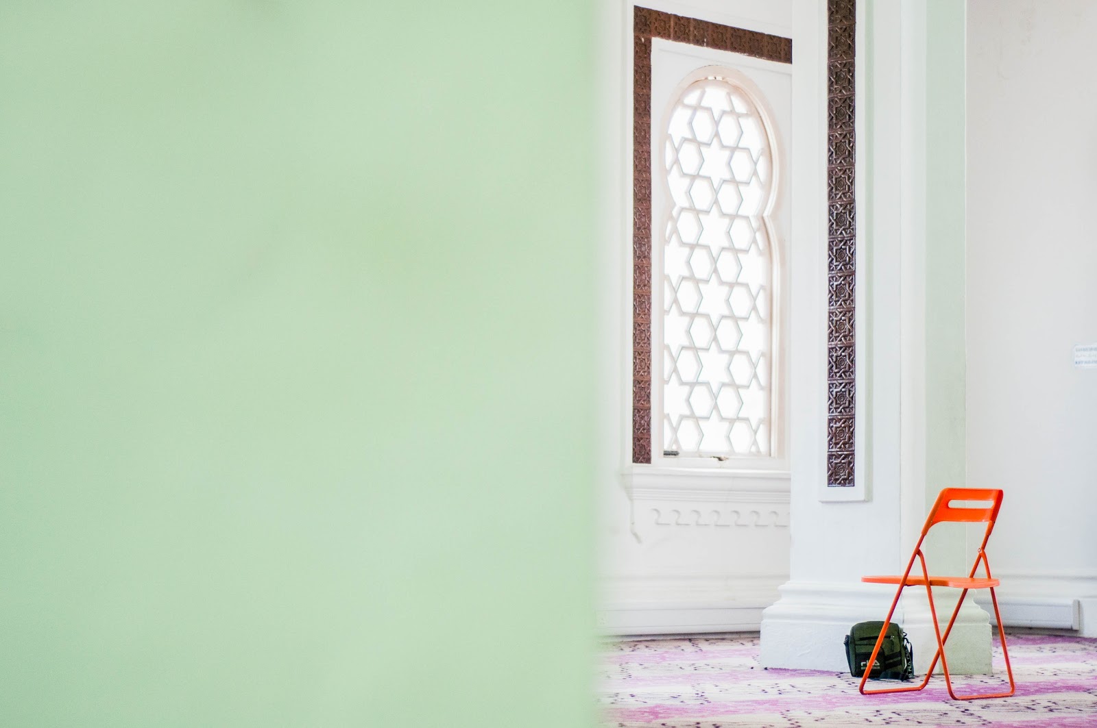
Photo: Unsplash
Greys/Muted Greens
Soothing colors are the trend right now. They are appropriate colors for the increasingly frenetic pace of life - and Covid-19. They have almost become a necessity. And among the calming colors, greyish green is at the top for its properties. Green, as we've already seen, is the most calming shade out there. A color with which to rest your gaze, which provides a feeling of tranquillity, like almost no other. Thus, greyish green combines the soothing properties of the standard green, but further enhanced by its low saturation and strength, resulting in one of the softest, softest, and most calming tones in the entire color range. The Bruguera color of the year, the Tranquil Dawn, is a tone that is born in counterpoint to this increasingly hectic and digital world. Yes, it lays among the greyish green tones that we see everywhere! It has already become clear that greyish green is one of the trend colors for its characteristics and soothing properties. Luckily, as it is a shade of grayish-green, it blends well with almost any color. It marries exceptionally well with warm tones such as beige or wood, which add the warmth that this color lacks. It allows you to create a palette for your home entirely in harmony.
Aegean Blue
Blues represent an emotion that evokes calm and relaxing properties. When dashed with a little grey, you can mute the brightness of any blue, by offering a more subdued outlook. Both are in the cold part of the chromatic circle, after all. Considering that this year has brought many stressful moments, we seek calm, and it is safe to say that calming colors have been the winners by a landslide. Another advantage that greyish blue has is that it is an elegant and versatile shade. It adapts very well to any space.
Photo: Unsplash
Savasana
This beautiful shade belongs to the Valentine firm, which last year designated it as a trend for walls. A warm tone and, of course, relaxing. As you can see, all the trend colors of 2020 are going this way: that of peace, relaxation and well-being. Unlike the two colors we have looked at first, grayish green and bluish gray, Valentine's Savasana is in the hot part of the color wheel, and is incredibly warm. Warm, and also relaxing. It is halfway between an off-white and a grayish beige—a tone with little saturation, very bright and welcoming.
It is also necessary to highlight its infinite combinations of this color, and it is that it can be easily combined with everything, but especially with tones of wood, earthy greens and reds such as a shade of terracotta.
Photo: Unsplash
Rose
The color pink was a trend years ago, especially Pantone's rose quartz, and since then it has not completed its message to the world of designers. However, pinks have evolved; into dusky pale pinks that bring an earthy value without the stark and cheap tones of pink. The pink earth tones belong to the hot part of the chromatic circle, so they are warm colors, with which to create very cozy environments easily. In addition, they also stand out because they are very bright thanks to their pigmentation. Another advantage of these colors is that they combine very well with wood tones and with the added extras of wicker baskets, furniture, and other accessories of untouched nature, it can bring interior dreams to life. Also, they allow an effortless way to achieve an elegant and sophisticated environment.
The 80s are back!
Chrome details, shiny finishes, holographic, and neon elements. The 80s are back to stay. Details that transport us to that golden age of design are represented in accessories and furniture. Modern standards can easily reinterpret it. The organic shapes and the presence of golden or silver finishes stand out on the legs and in details of chairs and sofas. Mixing the opulence of the time with functional and contemporary silhouettes that we can see very frequently in pieces of furniture and lamps from the most recognized design houses in the industry. When we add modern and retro together, we can be presented with something quite exquisite in style.
Marbles and natural stones
Large-format wall tiles are a must for 2020 and beyond. This is because it allows us to create a sense of eco-friendly interior design. With the new technologies and innovations of recent years, it has been possible to transfer the beauty of natural stone to large and increasingly light formats that facilitate installation on walls and floors, creating elegant and tasteful spaces. If you love stone, you will surely love the tiles that imitate natural materials. This allows you to work much more accessible with them whilst still looking realistic. We have also seen a lot of marble among dining tables, and details in bathrooms and other spaces in the house, which certainly make it feel magical.
Finally, we have to talk about the 2020 color trends as chosen by Pantone. After Marsala (2015), Quartz Pink, and Serenity Blue (in 2016 two shades were chosen) and Greenery Green (2017), it was time to choose the color of the year. And this year, the choice has been surprising and intense. Ultra Violet is the color trend 2020 according to Pantone. Can you see your home benefiting from this color? It’s time to start getting on-trend with the tones and textures that every home can benefit from.

Post a Comment